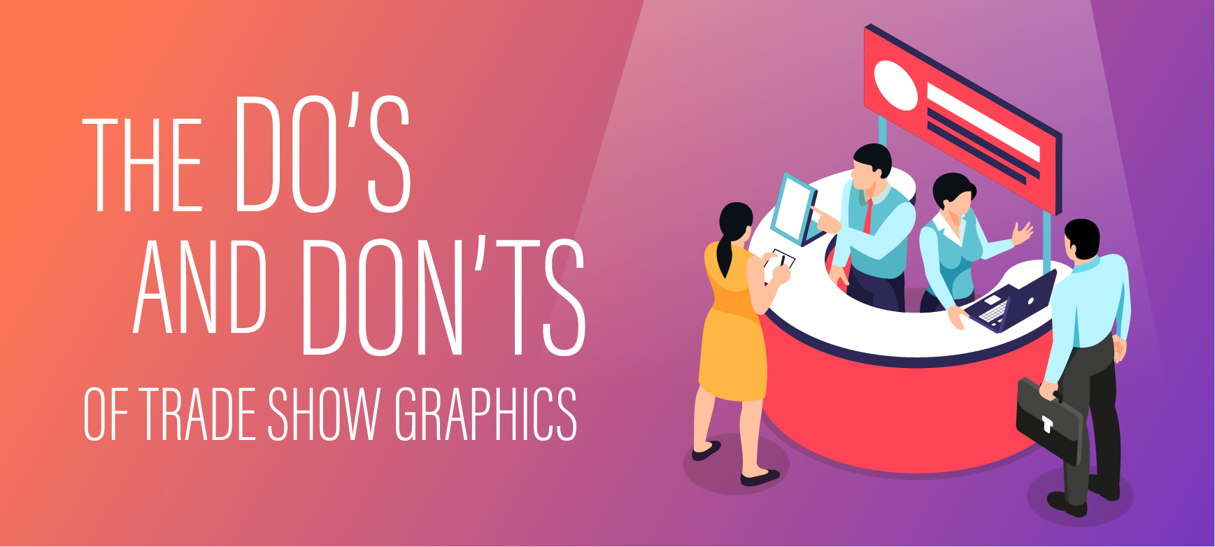


Design 101 | How to Produce Quality Graphics for Trade Show Displays
When it comes to trade show displays, you can instantly see the difference between good and bad design. Why? The aesthetics of a well-designed product are usually pretty obvious (and so are badly designed products).
You know what bad design looks like, right? But, have you considered the solutions?
Confusing Messaging?
Whether the company is just trying to do too much, or the brand isn’t displaying a message that is really clear or cohesive–the end result is the same. The display may appear scattered or disorganized, and the image of the company is affected.
Instead of allowing confusing messages to undermine your public image (and the efficacy of the display), you must determine what your message is, how you want to communicate that message. How can you effectively make use of the trade show display to tell your story? These are core questions that should be considered down to your company’s very existence. Who am I and who are we? What do we want to say and who do we want to say it to?
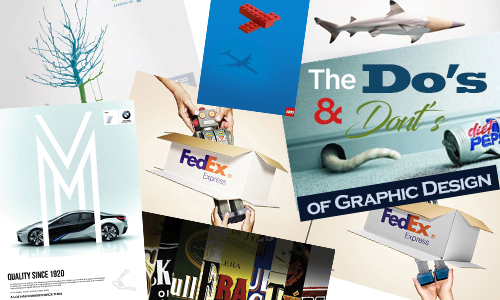
Too many graphics?
Just because you have access to lots of great graphics doesn’t mean that you should use them all. The excessive use or mis-use of graphics–even high-quality ones–can lead to a perception that the company is disorganized, overly ambitious, and perhaps even not targeted or strategic in focus.
 So, instead of throwing in every great image you have, be strategic in your selection of graphics. If possible, make sure that the graphics you use are high-quality, but also pick the best of the best. If you have 10 images that purvey message you want to put across, pick the best one and use that in a strategic location in the display. Overkill is not always the best approach.
Size Matters, But So Does Budget
The size of the display relates to how effectively you can tell your story, but so does staying within your allotted budget. With a larger display, you’d have more space to fully develop your message.
 Instead of trying to be too big for your allotted space, be realistic with what you’ll be able to accomplish with your messaging, and also plan for the future. You have limited space now, but plan for those display enhancements that you’ll be able to add as you go along. As you continue to demonstrate the true value of the display that’s currently in place, you may find that additional budget will be allocated. But, you’ll also find that you can use technological bells and whistles (and strategic lighting) to do a great job with the space that you have.
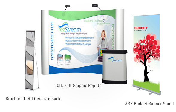
Great impact can come in small sizes…
Text, Text, and More Text
You’ve probably seen those trade show displays that you glance at and then walk right on by, because you just know that it would take an hour (or more) to read all the different text blocks. There’s just too much text, and you don’t have the time (or inclination) to spend that much time deciphering what the company is really about–if you have to put that much work into it!
Instead of overwhelming the display with a complete history of your company, make use of text as you would spice. Words contribute to the overall message you’re trying to purvey, but your display is not a book! Be on-point and be strategic with your use of text. The perfect image can replace a thousand words. Make sure that important text such as company name are at eye level and can be spotted from any area within or near the booth. There is no point in putting valuable text towards the bottom of any display because something is bound to block it!Other important types of information might include website and/or QR code, company name and/or logo, and a few targeted points about your company or product. If you wish to give a story or company history make your display more interactive and add a flat screen with a powerpoint presentation or narrative and keep the actual graphics on your display text light.
Poorly Implemented Images
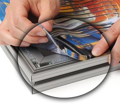
Yes, you’ve also seen those displays that obviously are making use of poor-quality graphics. There’s pixelation and it’s difficult to even determine what message the company is trying to put across. The overall quality of the display is just so bad that your eyes hurt to look at it. While operating on a shoestring budget, this situation may have even happened when looking at your own company’s display. It is wasted effort to spend money and time on a new display to boast your company or products, only to have a sub par visual presentation.
Instead of being embarrassed and throwing up your hands in hopeless dismay, why not focus on the solutions? Just as you may not have a lot of control over the size of your display, the quality of your images may be outside of your direct control. Sometimes you just have to work with the resources that you have available, and you can still make the display look great, even with low-resolution images.
Here are some considerations when you’re dealing with poor-quality images:
- Instead of attempting to enlarge low-resolution images (so that the pixelation is obvious) make use of your images in small or artistic ways. Decreasing opacity to create a thin veil of image over something else is one example. You can also create a composite image utilizing smaller images.
- Use color, stock imagery, text and other elements to draw attention away from the poor quality images. The most powerful branding is often quite simple!
- Match PMS (pantone) colors–to ensure that all the colors in yourdisplay mesh with your established and approved branding strategy.
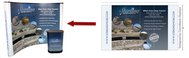
- TIFF (Tagged Image File Format) is usually the preferred file format for large displays, because it’s more flexibe. You can save and re-save the image without losing quality (unlike JPG files, which features a lossy form of compression).
- Vector files such as .AI, .EPS, or PDF are preferable when dealing with logos and vector based designs because vector is point based and can be blown up or shrunk down without any quality loss.
Your trade show display can be a powerful and effective message, but it takes time, energy and focus to get it right! There are great, creative ways to work with what you have (as far as content and image requirements) as well as budget considerations–to ensure that your display is top notch.
To learn more on Camelback Displays general graphic set up instructions read our General Graphic Guidelines.
No Comment